Time Based Heatmaps in R
Creating a Time Based Heatmap in R with GGPlot
Recently I've been very into the idea of time-based heatmaps as an easy way of understanding relative aggregates by date and time. I think it's important to view behavior by time as the numbers are often very different when looking across time intervals such as year, month, day of the week, hour etc. For example, US consumers shopping patterns typically ramp up during the October-December months with a drop off in January. Another example could be coffee shop orders by time of day. Intuitively, we expect the coffee sales to peak during the morning and early afternoon hours.
So that covers the why I like time period analysis, but why do I like heatmaps? Well, heatmaps can pack in a dense amount of information into an information grid which will very quickly allow the user to identify relative patterns. For example, Looking at the raw data set below (left) does not have the same impact as looking at the equivalent heatmap (right).
Tutorial Scenario
In this tutorial, we are going to be looking at heatmaps of Seattle 911 calls by various time periods and by type of incident. This awesome dataset is available as part of the data.gov open data project.
1) Set Up R
In terms of setting up the R working environment, we have a couple of options open to us. We can use something like R Studio for a local analytics on our personal computer. Or we can use a hosted, multi-language collaboration environment like Watson Studio. In this tutorial we are going to be using IBM Cloud Lite account and Watson Studio to host our data set and and run the R analysis. Note: the same R code can be run in any R environment.
A) Sign up for IBM Cloud Lite - Visit bluemix.net/registration/free
Follow the steps to activate and set up your account.
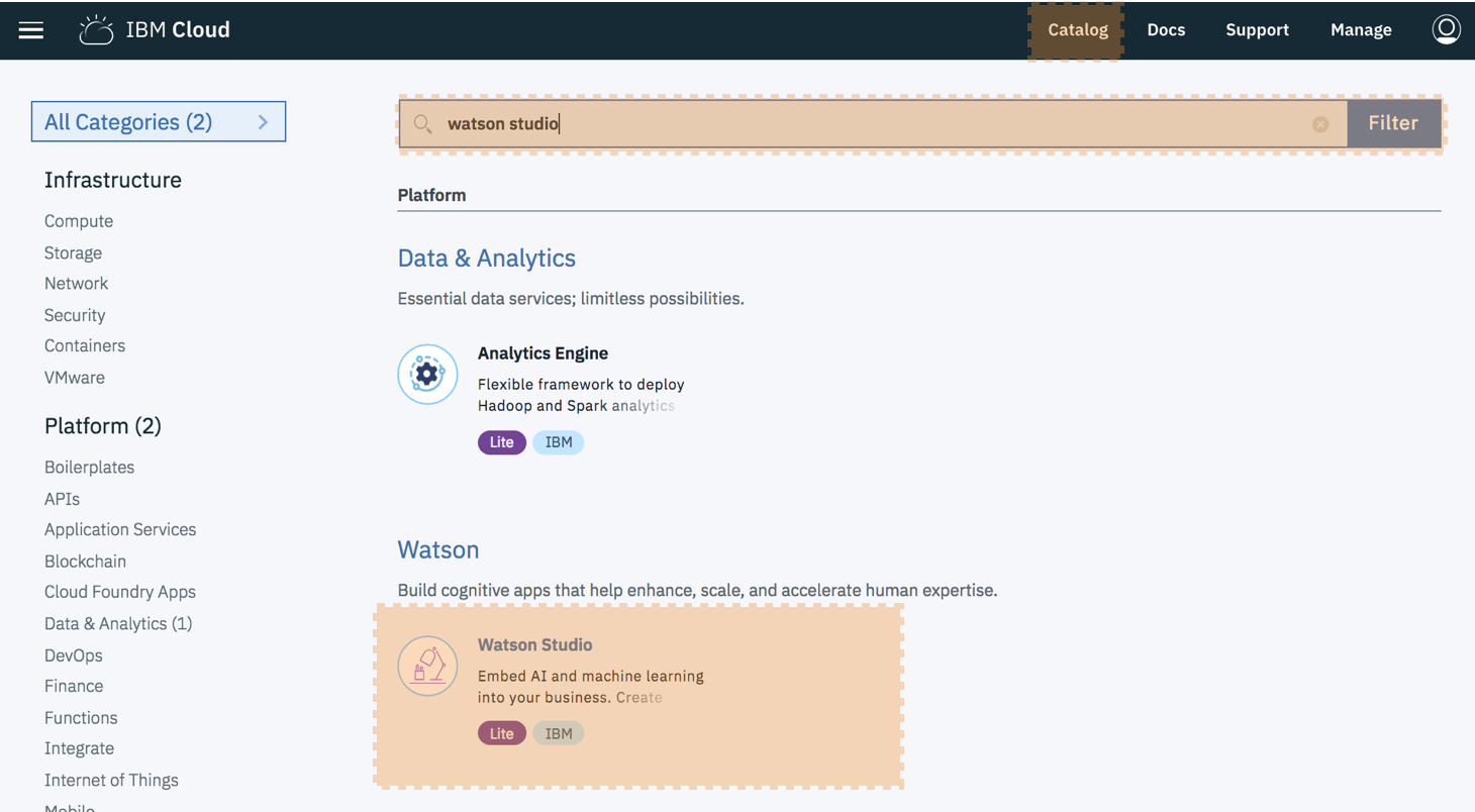
B) Deploy Watson Studio from the catalog. Note this was previously called Data Science Experience.
Select the "Lite" plan and hit "Create".
You will then be taken to new screen where you can click "Get started”. This will redirect you to the Watson Studio UI.
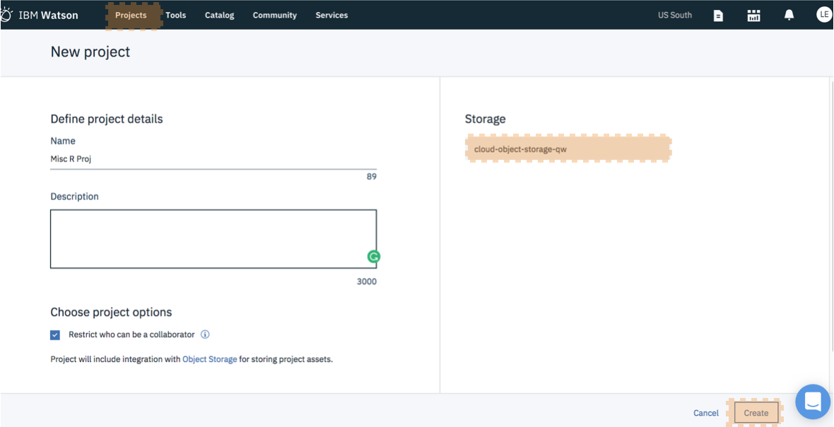
C) Create a New Project - It's best to start by creating a project so that you can store the R notebook and other assets together logically (models, data connections etc). Create the project. If this is your first project, you will also need to create an object storage service to store your data. This is free and just a few clicks.
D) Create a New Notebook - Notebooks are a cool way of writing code, because they allow you to weave in the execution of code and display of content and at the same time.
Select "Assets". Select "New Notebook". Set the proper paramaters: name, description, project etc.
Ensure you select an R environment as the notebook environment. Click create
For each step below, the instructions are: Create a new cell. Enter the code below. Run the code by pressing the top nav button "run cell" which looks like a right arrow.
Note: If you need to close and reopen your notebook, please make sure to click the edit button in the upper right so that you can interact with the notebook and run the code.
2) Install and load packages
R packages contain a grouping of R data functions and code that can be used to perform your analysis. We need to install and load them in Watson Studio so that we can call upon them later. As per the previous tutorial, enter the following code into a new cell, highlight the cell and hit the "run cell" button.
# Install the relevant libraries - do this one time
install.packages("plyr")
install.packages("lubridate")
install.packages("ggplot2")
install.packages("dplyr")
You may get a warning note that the package was installed into a particular directory as 'lib' is unspecified. This is completely fine. It still installs successfully and you will not have any problems loading it in the next step. After you successfully install all the packages, you may want to comment out the lines of code with a "#" in front of each line. This will help you to rerun all code at a later date without having to import in all packages again. As done previously, enter the following code into a new cell, highlight the cell and hit the "run cell" button.
# Load the relevant libraries - do this every time
library(plyr)
library(lubridate)
library(ggplot2)
library(dplyr)
Load Data File into R and Assign Variables
In this example we are going to load the data set right from the data.gov website. This will allow you to ensure that you get the latest data as it updates every four hours! We will then be assigning a few color variables that we will use to create the heatmaps. Note you don't need to supply your own color variables, but I like to try pretty new color combination. Finally, we are going to look at the data set and attach the column names so that we can reference columns by name vs by the full dataframe + name combination.
#Data Set Located at: https://catalog.data.gov/dataset/seattle-police-department-911-incident-response-52779
incidents <-read.table("https://data.seattle.gov/api/views/3k2p-39jp/rows.csv?accessType=DOWNLOAD", head=TRUE, sep=",", fill=TRUE, stringsAsFactors=F)

#If the above data set is unavailable please use this code
#df= fread('https://raw.githubusercontent.com/lgellis/MiscTutorial/master/ggmap/i2Sample.csv', stringsAsFactors = FALSE)
#incidents <- df


#Assign color variables
col1 = "#d8e1cf"
col2 = "#438484"

#Peek at the data set and attach the column names
head(incidents)
attach(incidents)
str(incidents)
Add Time Variables with Lubridate
Next, we need to prepare our dataset. Luckily, the source data has a nicely formatted timestamp field and we don't need to do much data wrangling. We can use the super handy lubridate package to gather time interval information such as month, year, week day, hour etc. We then will peek at the dataset and attach the column names.
incidents$ymd <-mdy_hms(Event.Clearance.Date)
incidents$month <- month(incidents$ymd, label = TRUE)
incidents$year <- year(incidents$ymd)
incidents$wday <- wday(incidents$ymd, label = TRUE)
incidents$hour <- hour(incidents$ymd)
attach(incidents)
head(incidents)
R Heatmap 1: Day/Hour
Create Summary Table in R
Next, we need to create a summary table which has all of the information we would like to display in the heatmap. In this case we would like to display the number of incidents by hour and day of the week. This is incredibly easy to do with the ddply function. We then need to reverse the order of the months factor so that they display nicely in the map.
dayHour <- ddply(incidents, c( "hour", "wday"), summarise,
                    N    = length(ymd)
)

#reverse order of months for easier graphing
dayHour$wday <- factor(dayHour$wday, levels=rev(levels(dayHour$wday)))
attach(dayHour)

Create Heatmap
We will create the heatmap using our trusty ggplot2! Note that, to create the actual heatmap we only need the first three commands. Everything after scale_fill_gradient() is just formatting gravy to make the chart more aesthetically pleasing.
ggplot(dayHour, aes(hour, wday)) + geom_tile(aes(fill = N),colour = "white", na.rm = TRUE) +
  scale_fill_gradient(low = col1, high = col2) +
  guides(fill=guide_legend(title="Total Incidents")) +
  theme_bw() + theme_minimal() +
  labs(title = "Histogram of Seattle Incidents by Day of Week and Hour",
       x = "Incidents Per Hour", y = "Day of Week") +
  theme(panel.grid.major = element_blank(), panel.grid.minor = element_blank())
Hourly and Daily Heatmap in R with GGplot!
Voila! We have our beautiful heatmap of incident totals by Day of Week and Hour using ggplot2!
R Heatmap 2: Year/Month
For heatmap 2 we are going to follow the same steps as above. The only differences is that we are now going to view by year and month.
yearMonth <- ddply(incidents, c( "year", "month" ), summarise,
                    N    = length(ymd)
)

#reverse order of months for easier graphing
yearMonth$month <- factor(summaryGroup$month, levels=rev(levels(summaryGroup$month)))
attach(yearMonth)

#overall summary
ggplot(yearMonth, aes(year, month)) + geom_tile(aes(fill = N),colour = "white") +
  scale_fill_gradient(low = col1, high = col2) +
  guides(fill=guide_legend(title="Total Incidents")) +
  labs(title = "Histogram of Seattle Incidents by Month and Year",
       x = "Year", y = "Month") +
  theme_bw() + theme_minimal()
R Heatmap 3: Group/Hour
For heatmap 3 we are going to continue with a similar approach. The only differences is that we are now now going to bring in a non-time based variable into the heatmap.
groupSummary <- ddply(incidents, c( "Event.Clearance.Group", "hour"), summarise,
                    N    = length(ymd)
)

#overall summary
ggplot(groupSummary, aes( hour,Event.Clearance.Group)) + geom_tile(aes(fill = N),colour = "white") +
  scale_fill_gradient(low = col1, high = col2) +
  guides(fill=guide_legend(title="Total Incidents")) +
  labs(title = "Histogram of Seattle Incidents by Event and Hour",
       x = "Hour", y = "Event") +
  theme_bw() + theme_minimal() +
  theme(panel.grid.major = element_blank(), panel.grid.minor = element_blank())
Next Steps
I hope y'all see this as just the tip of the iceberg. You can create time based heatmaps on anything and using any summary value. In the above examples, we displayed total counts of incidents in the heatmap. However, if we were displaying something like sales data, we could use the ddply function to gather the average sale, median sale, min, max etc for display. We can also create different heatmaps for particular categories. The possibilities are endless :)
Thank You
Thank you for exploring time based heatmaps with me!
Please comment below if you enjoyed this blog, have questions, or would like to see something different in the future. Note that the full code is available on my github repo. If you have trouble downloading the file from github, go to the main page of the repo and select "Clone or Download" and then "Download Zip".


