
Highlighting with ggplot2: The Old School and New School Way
Highlighting your Data in R
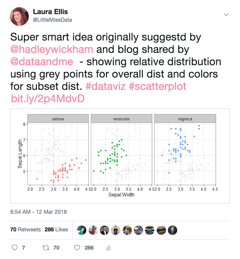
A while back I had tweeted about a really cool technique that can be used with ggplot2 in R to highlight a subset of your data, while keeping in perspective the trend of the full data set. I found out about this trick through a bit of a tangled web. Please stay with me while I lay it out for you. It all started with a tweet that Mara Averick shared from a blog that Simon Jackson wrote about a technique that Hadley Wickham discussed in his ggplot2 book. Confused yet? Well, the good news is that actually implementing the technique is a lot easier than following the discovery path!
Highlighting Your Data in R: The Old School Way
To implement this idea, we don't need any fancy packages other than ggplot2. The steps are simple:
Using ggplot2, create a plot with your full data set in grey.
Create a new data frame that has been subset to only include the data which you would like to highlight.
Add the highlighted data on to your plot created in step 1. Set the color to something other than grey.
Celebrate!
Example
For our example, we are going to examine the crime incident dataset from Seattle 911 Calls on data.gov. Note that I have covered this data set through multiple blog posts already such as map plots in R and time based heat maps.
Set Up R
In terms of setting up the R working environment, we have a couple of options open to us. We can use something like R Studio for a local analytics on our personal computer. Or we can use a free, hosted, multi-language collaboration environment like Watson Studio. If you'd like to get started with R in IBM Watson Studio, please have a look at the tutorial I wrote.
Install and Load Libraries
install.packages("lubridate")
install.packages("ggplot2")
install.packages("ggmap")
install.packages("data.table")
install.packages("ggrepel")
install.packages("dplyr")
install.packages("magrittr")

library(lubridate)
library(ggplot2)
library(ggmap)
library(dplyr)
library(data.table)
library(ggrepel)
library(magrittr)
Download the Data
incidents= fread('https://raw.githubusercontent.com/lgellis/MiscTutorial/master/ggmap/i2Sample.csv', stringsAsFactors = FALSE)
str(incidents) attach(incidents)

# Create some color variables for graphing later
custGrey = "#A9A9A9"

#add year to the incidents data frame
incidents$ymd <-mdy_hms(Event.Clearance.Date)
incidents$month <- lubridate::month(incidents$ymd)
incidents$year <- year(incidents$ymd)
incidents$wday <- lubridate::wday(incidents$ymd, label = TRUE)
incidents$hour <- hour(incidents$ymd)

#Create a more manageable data frame with only 2017 data
i2 <- incidents[year>=2017, ]

#Only include complete cases
i2[complete.cases(i2), ]

attach(i2)
head(i2)
Create a basic time series plot showing the count of 911 event types by month.
#Group the data into a new data frame which has the count of events per month by subgroup

groupSummaries <- i2 %>%
  group_by(month, Event.Clearance.SubGroup) %>%
  summarize(N = length(Event.Clearance.SubGroup))

#View the new data set

head(groupSummaries, n=100)
attach(groupSummaries)

#Graph the data set through ggplot 2

ggplot(groupSummaries, aes(x=month, y=N, color=Event.Clearance.SubGroup) )+
  geom_line() +
  theme(legend.position="bottom",legend.text=element_text(size=7),
        legend.title = element_blank()) +
  scale_x_discrete(name ="Month",
                 limits=c(3,6,9,12))
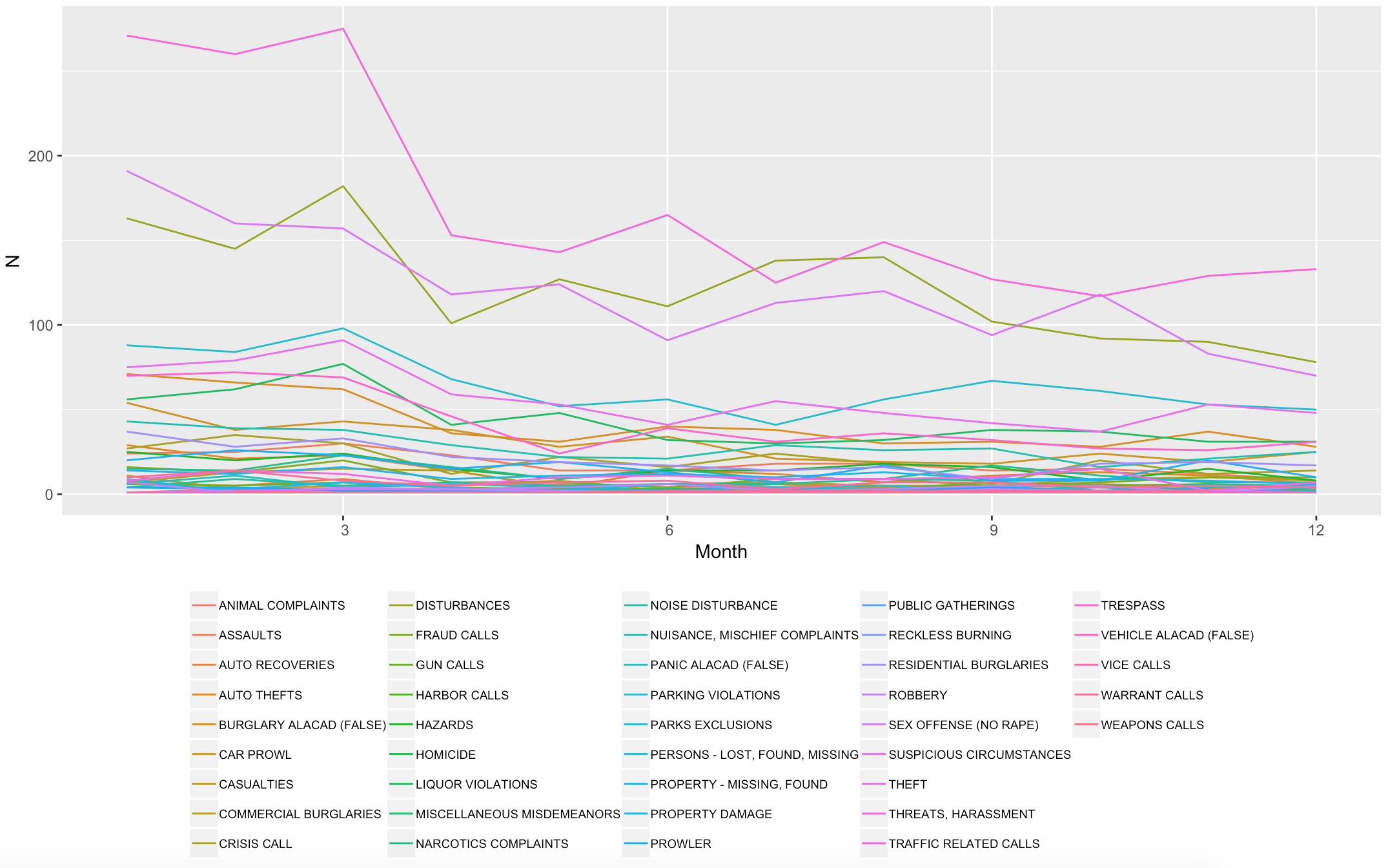
Create a Graph Highlighting Data with a Max Month Count of 95 or Greater
# Create a data frame with only events types that have had a peak of 95 calls in a month or more

groupSummariesF <- groupSummaries %>%
  group_by(Event.Clearance.SubGroup) %>%
  filter(max(N) > 95) %>%
  ungroup()

head(groupSummariesF)

# Create a layered plot with one layer of grey data for the full data set and one layer of color data for the subset data set

ggplot() +
  geom_line(aes(month, N, group = Event.Clearance.SubGroup),
            data = groupSummaries, colour = alpha("grey", 0.7)) +
  geom_line(aes(month, N, group = Event.Clearance.SubGroup, colour = Event.Clearance.SubGroup),
            data = groupSummariesF) +
  scale_x_discrete(name ="Month",
                   limits=c(3,6,9,12)) +
  theme(legend.position="bottom",legend.text=element_text(size=7),
        legend.title = element_blank())

One of the great things about the "old school way" of doing this type of highlighting is that it can be done with presumably every extension to the ggplot2 package. For example, you can use this same technique to highlight with the ggmap package. The code for these graphs is incredibly simple and has been included in my github repo.

Highlighting Your Data in R: The New School Way
While the above methodology is quite easy, it can be a bit of a pain at times to create and add the new data frame. Further, you have to tinker more with the labelling to really call out the highlighted data points.
Thanks to Hiroaki Yutani, we now have the gghighlight package which does most of the work for us with a small function call!! Please note that a lot of this code was created by looking at examples on her introduction document.
The new school way is even simplier:
Using ggplot2, create a plot with your full data set.
Add the gghighlight() function to your plot with the conditions set to identify your subset.
Celebrate! This was one less step AND we got labels!
Example
For our first example, we are going to create the same time series graph from above. However, we are going to perform the highlighting with gghighlight vs manual layering.
# Install the gghighlight package

install.packages("gghighlight")
library(gghighlight)

# Create the highlighted graph

ggplot(groupSummaries, aes(month, N, colour = Event.Clearance.SubGroup)) +
  geom_line() +
  gghighlight(max(N) > 95,  label_key = Event.Clearance.SubGroup) +
  scale_x_discrete(name ="Month",
                   limits=c(3,6,9,12))
More Examples
Well that was so easy, we are going to try a few more ggmap plot types to see how we fare. Below show both a scatterplot and histogram chart.
# Try a scatterplot chart

ggplot(groupSummaries, aes(month, N, colour = Event.Clearance.SubGroup, use_group_by=FALSE)) +
  geom_point() +
  gghighlight(N > 200,  label_key = Event.Clearance.SubGroup) +
  scale_x_discrete(name ="Month",
                   limits=c(3,6,9,12))

# Try a histogram chart

ggplot(groupSummaries, aes(N, fill = Event.Clearance.SubGroup)) +
  geom_histogram() +
  theme(legend.position="bottom",legend.text=element_text(size=7),
        legend.title = element_blank()) +
  gghighlight(N > 100,  label_key = Event.Clearance.SubGroup, use_group_by = FALSE) +
  facet_wrap(~ Event.Clearance.SubGroup)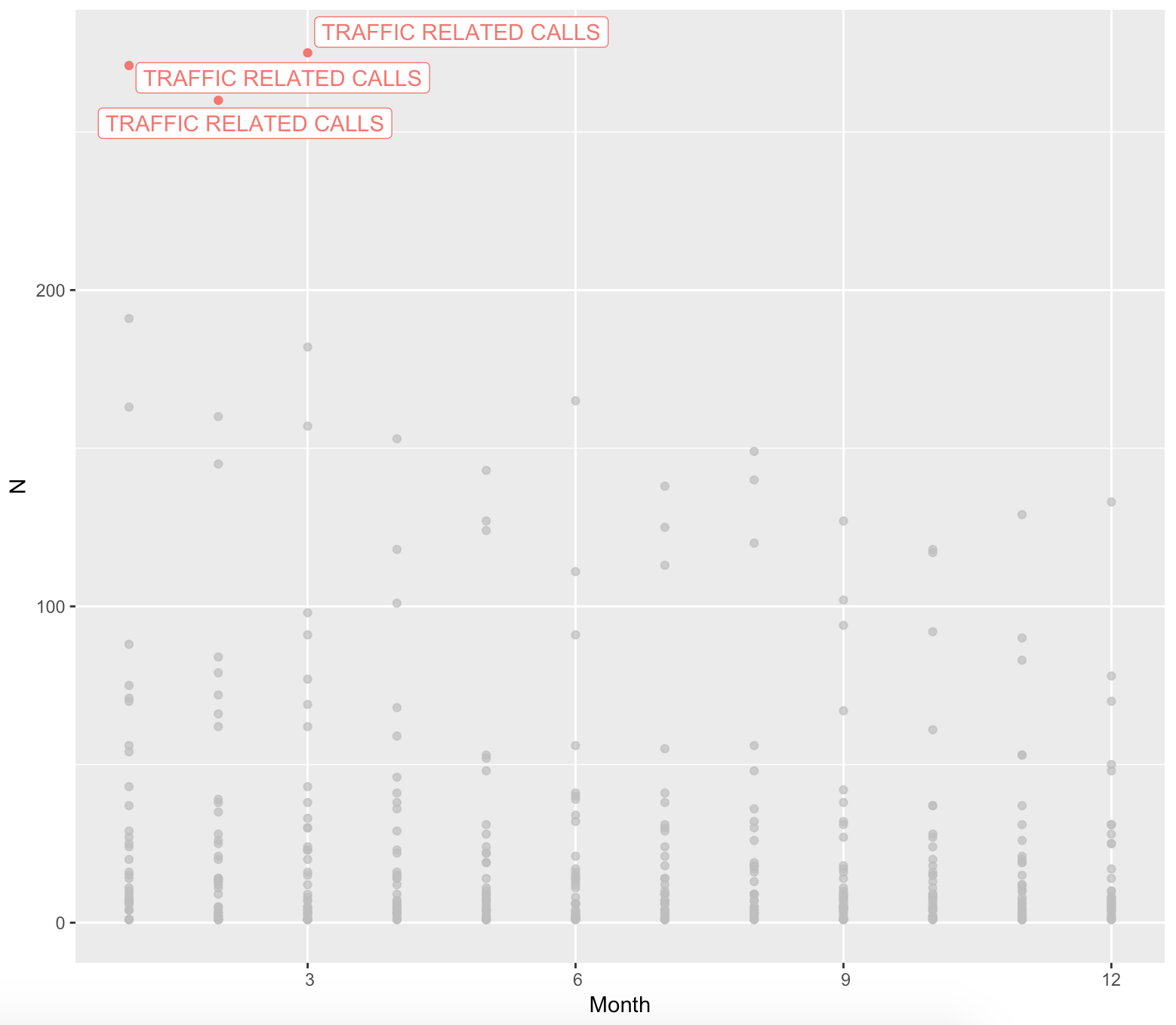

Thank You
Thanks for reading along while we explored data highlighting through layers and gghighlight. Please share your thoughts and creations with me on twitter.
Note that the full code is available on my github repo. If you have trouble downloading the file from github, go to the main page of the repo and select "Clone or Download" and then "Download Zip".


